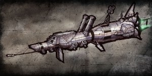
 Welcome back! The Sketch of the Week’s themes are Civil War, Apollo 11. Civil War (courtesy of Wendog), and the Apollo 11 in honor of the anniversary of the moon landing. No third theme this week. Sorry, I just thought the first two themes were so contrasting one more might be pushing it.
Anyways I can’t decide if the concept art is getting weirder or more creative. Its amazing how close genius and madness really can be. I guess it’s just on of those things history decides.
I’m pretty happy with how this weeks sketch came out. The old photograph texture really helps play out just what the theme is. I did that with a load of PS brushes on multiple layers. A lot of the inspiration came from civil war era steamboats, warships and a submarine. Yes apparently there was a sub back in that era. You can see it here.
If I made a summery of just what I did I would say I pulled the 45 degree angles and rivets from the civil war era and added them to a Saturn V rocket. Throw in a few smoke stacks and support wires for good measure and this is what you get. Originally I had this in full color but it just made more sense to give it the ye old photograph look. I threw in the green flame for no other reason than it just looked cool.
That’s it for this week. As always let me know what you think about this week and what I should do for next week.
A
O yea and FYI old skool astronauts were bad asses with huge huevos. Did you know they fixed a broken circuit breaker with a pen while on the moon! Without it they couldn’t take off. They also only had minutes of oxygen left when the launched off the moon. Now a days we are scared if their toilet breaks down.
Great concept again. For coming from such a sucky artist that is. The Texture is really awesome, and really adds to the feel of this sketch. It would be cool if you added a few more greenish lights elsewhere throughout the ship. I am really careful to not isolate color in a composition once I have committed to add color to a sketch. Also, why did you choose to utilize the thick black outline. I have seen it work really well in some automotive concept work. I like it best when it is only on one side and gives the appearance of a directional light source. But most of the time I find it to be a little distracting.
I wuld like to see you stretch you concept chops with some environment work. That is if ytou didn’t suck so much.
1. wild west town
2. futuristc cathedral
3. sunken pirate ship
4. a jungle fort partially consisting of a crashed WWII fighter
5. the future Toronto Bills locker room or stadium
6. a circus tent
any of these environments could be really cool with a twist of some sort. (futristic enhancements, aliens, animals acting like humans, ghosts, ect…)
It would of helped to put a couple accents using the green lights. Next time.
I added the black line when i was almost finished with the sketch. The drawing lacked some line weight. Probably could of made the outline a little thinner. O well.
I’ve been thinking about doing a environment for a while now but ive been putting it off due to time constraints. But i guess now is as good a time as any.
Do something with animals – like cats or unicorns!!
How about Cat + Unicorn = Caticorns!
I love caticorn. Some people say it is the worst halloween candy, but I love it. I really love the caticorn pumpkins the most though.