SOTW Space Fighter Concept Art
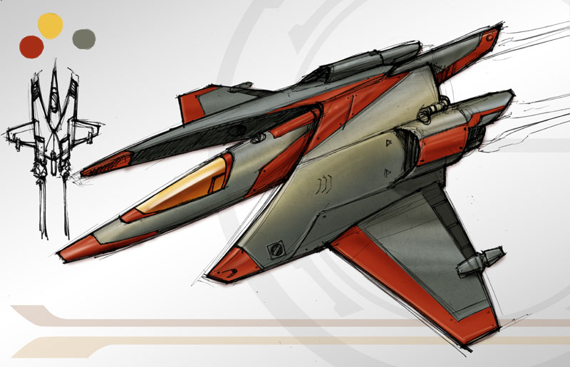
This weeks Sketch OTW is just a quick concept for a Space fighter. After letting it sit for a week I can already see a few things I’d like to add. Like a glowing jet stream and maybe some visible guns. But maybe this would work for a civilian model. I continued to overlay some metal textures from my favorite texture site. Most of the color was done by laying down a flat color I chose (each color on a separate layer) and then hitting them with the dodge and burn tools. Adding some color gradients at the end.
No thumbnails to go with this one so as a conciliation price I give you the evil Devil monkey! Enjoy!
Tron Recognizer Concept SOTW Dec 20/09
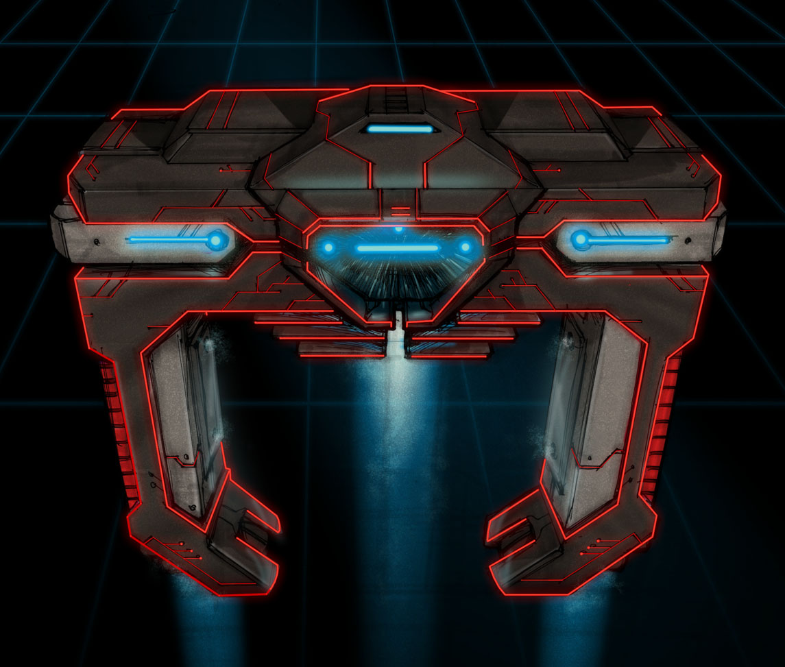
It’s about time! Finally, the final sketch for my Tron Legacy concepts. This week’s concept is the Tron Recognizer. I always hated these things on the movie and it was not because I didn’t like how they looked or they scared me a child. No, it was because the Intellivision’s “Deadly Disk of Tron” video game. http://www.allgame.com/game.php?id=20552 The game cheats and the booklet tells you that you can destroy the Recognizer by hitting it in the “eye”. Much like cake, the eye was a lie. Young, fat Andy wasted many days trying to beat that game and never did manage to destroy the in-game Recognizer. Not to mention, I’m pretty sure it just repeated on forever.
Anyway, I stayed close to the original version’s body shape. The original felt kind of skinny, so on this one I tried to beef it up by adding heavy shoulders and a thicker mid-section. That helped give the look more of an intimidation factor. I also tried to add some function to the look by adding some mechanical looking sections. For example, the silver-ish pieces on either side of the shoulders are rotating cannons. You can see more of that on the rough sketches.
My favorite addition is the power source in the mid-section. Imagine, if you will, a screen that starts out pitch black and the blue glow emerges out of the darkness followed by the red lines. Could totally be one of those O $#^@* moments in a movie. I also liked the addition of the blue lights coming out of the bottom. It looks like a jet stream in the sketch but really I see it as more of a spotlight or a tractor beam.
If anything color and texture has been one of my weak points, so I tried to push it a little this week. I didn’t go crazy, baby steps. I added a galvanized metal texture over the body and set the layer style to a soft light. The beams of light are a combo of gradient and some new texture brushes I found. And the chest glow is just a layer style (glow) with the noise turned up.
Well, that’s the last of the Tron series. Not sure what’s next but I’ll figure something out.
A
The Tron Light Cycle Concept Nov 21/09
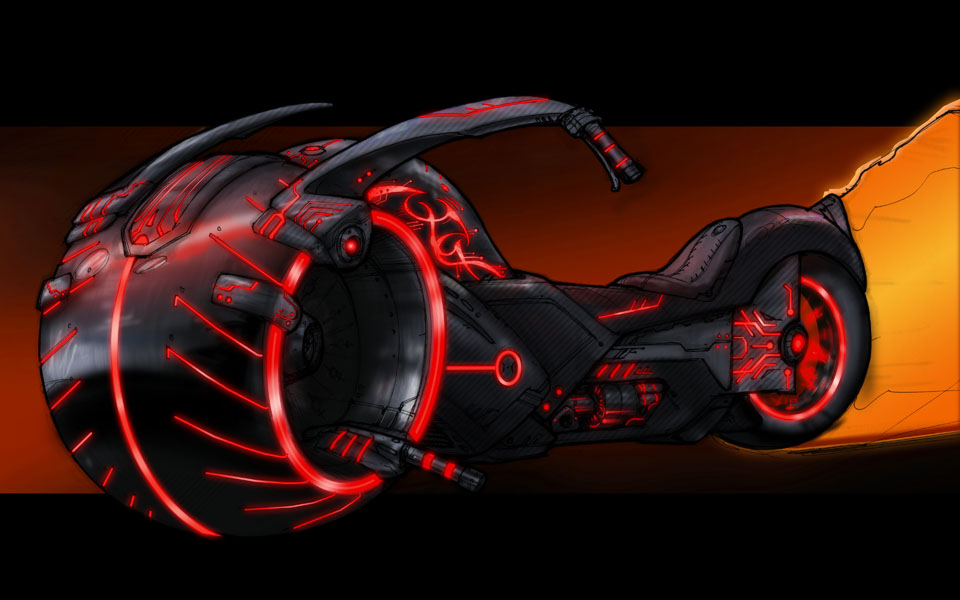
As promised this week, I worked on some concept art for the Tron light-cycle. The original light-cycle has to be one of the coolest looking vehicles in movie history. In the top three at least, next to the X-wing and the dog van from Dumb and Dumber.
Anyways, I really wanted to draw the crotch rocket version of the light-cycle but the demon voices in my head kept telling me “Stop sucking and do something unique”. So then it hit me, wouldn’t it be sweet if there were a chopper version of the light cycle?
It was a little tough to keep the tech look with the chopper feel but it worked out pretty well. The hardest part was finding a place to attach the handlebars and make them look in place. Wrapping them around the wheel and connecting them in the wheel well became the best solution. I’m also a fan of the barbwire detailing on the gas tank too. That accent really seemed to combine Tron and the chopper feel.
Originally, I started with blue highlights but decided to go red to keep with the bad boy feel. Finally the fire red/orange jet stream is a nod to the Ghost Rider.
Come back next week to see my version of the Recognizers. I’ve been having a good time with the last two Tron sketches so why not go with it? See ya in a week.
A
Sketch of the Week November 13/09
So, for those of you who haven’t heard, Disney finally announced that they are coming out with Tron 2! That’s right Tron, the precursor to The Matrix. I can’t believe it took those jokers sooo flipping long. The story will probably be horrible but at least it will look pretty (see Star Wars 1-3). The teaser trailer is amazing! Is Flynn good? Is he bad? I DON’T KNOW!
The new light cycle looks sweet… from a distance. I just don’t like how the rider sits on the bike. So next week I’ll take a stab at the bikes but this week, I tweaked the tanks from Tron. Much like the storm troopers from Star Wars, the tanks looked sweet but were completely irrelevant.
I’m a bit of a purist, so I tried to keep the overall tank form the same and just updated the style. You can see a little of my thought process in the rough sketches. I tried everything form centering the gun turret, different types of tread, even a windshield. The wheels like rings on the side were added to imply wheels or tread. They don’t touch the ground at all but they help the tank look mobile unlike the original version.
The colors did need to be updated but obviously I didn’t do to much with that. The old orange was a little dull so I pushed the chrome up a little. Less is more. Finally adding all of the glowing lines. So many designs have been ruined by people overdoing the glowy lines and while glowy lines may look sweet, don’t use it as a crutch people! Just use it on the areas where you want to highlight something. Anywhere else use it sparingly.
All right, that’s all I got. Let me know what sucks in the comments. I’m looking forward to the light cycle next week.
A
Sketch of the Week November 4/09
I hope everyone has one last little bit of Halloween in them! I missed the past week due to a fairly big freelance project with a tight deadline. Gotta pay the bills I guess. I was hoping to get in a few more Halloween sketches but what cha gona do?
So as promised I give you ZOMBIES! And not just zombies but zombie clowns no less! I’ve just combined two of the creepiest things on this planet. I dare you to think something creeper! O wait is that zombie on the bottom left Zombie Ronald McDonnald? Heck yea complete with dollar menu cheeseburger. Zombie can has cheeseburger!
I honestly cant give a good reason for the sepia tone other than I found an old photo online and it just looked creepy. So I figured what the heck try it out. For a sketch I think it works. Could be a cool story as to why someone would of taken this vintage photo of some zombies.
O and who couldn’t love the cute little midget zombie clown. I just want to pinch his lil zombie nose as it squeaks at me…. and then proceeds to bite my face.
One last note I realized it helps to think of people with Cerebral Palsy when drawing zombies. No I’m not trying to make a mean joke it’s a helpful tip. The contortions of the body just seems to have an odd parallel.
Se ya next week as always I’m always open to sketch suggestions.
A
As an added bonus I found this sweet picture of a zombie baby. Isn’t he cute!
Sketch of the Week October 14/09
So I was spending some time thinking about what the heck the theme is going to be for the sketch of the week and then I realized “It’s freaking Halloween!” So that being said my killer themes for this week are Witch, Knight and Botany. No Botany isn’t when you sleep with sheep it’s the study plants. Get your mind out of the gutter.
All things considered I like how she came out. I would of liked to push the color more but a great man once said “artwork is never done it’s just strategically abandoned”. Or at least I think someone once said that. I tried to make her armor somewhat light but still have that medieval knight look. She does not need too much heavy protection, incase you haven’t noticed there is a huge golem behind her. That’s actually my favorite part. It’s subtle but what has what has not been seen cannot be unseen!
Obviously the botanical part comes in with the golem but you can see small accents of vines on her legs, stomach and hat. Depending on the situation I can see the vines covering her body for more protection or just to show emotions. One more thing to note about the golem is that it’s mimicking her pose like a puppet. I thought that was a cool dynamic to the image.
If you cant see the witch influence. Well that’s your problem.
Good things to look forward to next week. ZOMBIES! “All we want to do is eat your brains. We’re not unreasonable no ones gona eat your eyes.” That could be one of the best songs ever.
Sketch Of The Week July 3/09
Here is the second part of this weeks sketch of the week. You can see last weeks here. It’s amazing how a little bit of color can really push a concept. I added a few things with color like the slobber in the mouth, some texture to the legs and back, and some stripes on the back and face. The combo of these really help give it that nightmarish feel or the feel of something sailors catch from dirty women. O and I almost forgot the addition of several more small eyes on the face to give it that extra creep factor.
That’s it for this week. Remember to give me more suggestions for next week.
Thanks,
A
Sketch Of The Week July 1/09
Its Wednesday again so once more I have to get off my lazy butt and do the Sketch of the Week! FYI this weeks concept art will be a 2 parter. I’ll repost the sketch with color on Friday afternoon. So that being said this week’s themes are dinosaur (courtesy of wendog), scary (jiggy) and insectoid.
I’m not sure if scary is 100% accurate but for sure creepy comes to mind. It’s concepts like this that make me question my sanity. Everything screams disturbing from the spider/crab like legs to the tiny little shrimp legs on the underbelly. This is the kind of thing you imagine in your head when you feel that bug crawling up your leg. Then you get that shiver, you know what I am talking about.
Then there is the odd hellish twist of the raptor like head with the needle teeth up top. I’m fairly happy with how things came out on this one, which is why I am pumped to add color to it soon.
The addition of color will really push the scare factor on this sketch. The addition of some more plates to the exoskeleton and some of the spines down the back will really push this up another notch. Slime on the teeth and tongue. The full nine yards. I haven’t decided the color pallet yet but I will probably start with a crimson red. We’ll see.
A


