Well I’m a day late but better late then never. This weeks themes were weather, 1920’s and art deco.
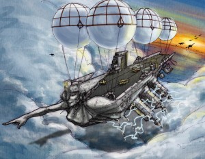
This one is called the goddess for obvious reasons. Not the most original name but the perfect fit for this fine ship. I really like how the main area of the hull came out. The combination of aircraft carrier and the oversized figurehead really made a cool looking airship. The figurehead is somewhat a combo of a figurehead on an old pirate ship and the hood ordainment on an old Buick.
The side stabilization thingys (that’s a good tec name right?) are an interesting feature. The idea is that they are there to manipulate the weather around the ship and lighten it so it could fly. Originally I was not going to add the lightning but it was really needed to imply a function on the ship. I could see these retracting inside the ship when it docks.
My major knock on this one is I don’t like the look of the weather balloons. In a revision I would swap them out for a zeppelin type balloon. Second the sky in the back blows. I really need to work on my skylines. For this I will accept full responsibility and blame it on lack of time.
That’s it for now. As always let me know themes you would like to see next week.
Thanks
A
Hahaha just happened to find a sweet tutorial for clouds here. O well, to little, to late.

Better late than never I guess. You could try to do it again, but the next time I would try to make it not suck so much.
The composition is awesome. The shadow on the clouds below the ship looks really cool too. This sketch has great character, and presence on the page. I love the themes and how you put them together. The round ballons look great. Everyone does a zeplin style baloo. This is way cooler and more original.
As for the sky that peeks through, try pulling some of the golden hues and orages in to the clouds. Isolating those colors makes that spot look wierd. also the lightning is too smooth and doesn’t look realistic. Try using a custom lightning brush, or making your own from a pic of lightning. That would help add some natural aspects to the ship that connect it with the environment around it.
The thing is when I sketch from real life reference its usually a person or object and never really something from nature. So i guess that is something i need to do more.
and i still don’t like the baloons
This is really cool looking, it looks like it would fit right in World of Warcraft, they have several zeppelins/gunships the resemble what you would like to change it to, so maybe you should check them out for reference =)
This one is called Orgrim’s Hammer:
http://images3.wikia.nocookie.net/wowwiki/images/a/a8/Orgrim%27s_Hammer.jpg
and this one is called The Skybreaker:
http://images4.wikia.nocookie.net/wowwiki/images/9/92/The_Skybreaker.jpg
And the Zeppelins:
http://www.wowwiki.com/Zepplin
I love this piece Andrew, very nice work.
what coincidence. I still think you suck.
Those were pretty sweet Jiggy. The WOW stuff is always amazing. I hate those guys with all my heart since they are so sweet My only knock is on the skybreaker one. It doesn’t really look like it could fly with the small propellers.
Thats one of my design snob pet peeves when something looks pretty but doesn’t look like it would function. This happens a lot on robot joints too. (extends pinky as he sips tea)