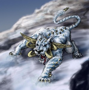
 Back with the Sketch of the Week. This weeks themes were monster (courtesy of Jiggybean) arctic, and tusk. Still managed to throw in some of what the European nation call “colour”.
I’m overall happy with how this one came out. As always I see pros and cons to this kitty. I’ll start with the likes. I like the concept and the look of the tusk. I can’t recall seeing a feline type animal with some sort of tusk. When brainstorming on making a artic monster, I referenced the Woolly Mammoth. The tusk on the woolly look freaking sweet in spite of what the rest of that dopey creature looks like. But I am not sure about 3rd/ back tusk. The jury is still out on that one. Wasn’t Mr. Snuffleupagus a Mammoth? He haunts my dreams…..
Anyway, the other pros are the face and that powerful forearm. Those really add some character to the beast.
Now the dislikes. While the background is not bad I think it could have been better. The value of the far back mountains is too similar. The far left should be lighter, the right more darker to help the composition. I knew this at the time but since it’s the background I didn’t want to spend too much time on it. Also, I think his back leg is broken. I don’t know what messed up with it but it just doesn’t look natural. One last complaint is that I think he could use some more markings in his fur.
That’s it for this week. Remember to give me more suggestions for next week. Jiggybean wanted something scary last week. But I want to go hellish scary next week. Maybe something like Hellish, insectoid, ???
A
Pretty cool. I see that you ducked my challenge from last week. Typical from someone that sucks like you do.
Sorry for the break up in posts. My baby just projectile pooped on the wall, and a team effort was needed for clean up.
As for this week’s sketch; I agree that The third horn just doesn’t look like it fits. Why so straight? Maybe if it was curled like a ram’s horn. The background/environment could add so much more life to the pick if there were some blowing snows. It would explain the depth of field and why the clsest thing to us (the rock) is so blurry. Try going to deviantat.com and searching for blizzard or snow brushes. It will give you some really cool and easy to use custom brushes. I have started using them alot. They are quick and really effective. Or affective. As for the back leg, I don’t think it is nearly as messed up as you think it is. The upper and lower anatomy of the leg is fine. I just think that you toes are pointing out when they need to go in. The knee points in, so try shifting the toes and claws to an angle that is more inward and under the body of this great white killing machine. (Killing me with your suckiness)
All in all pretty sweet. Great pose, character in the face, and value structure in the cat. I know the backgrounds are secondary and these are just cool sketches, BUT………… More complete backgrounds although they do take time, can give a piece that extra little push to go from cool to phenominal. Good job. You get better every week.
lets see some more fun character stuff. Like the magican and football hippo stuff.
today’s suggestions
1. animals doing human things (not sex)
2. dinosaurs!!!!!!!!!!
3. under water scenes
4. design YOU as a mario kart racer
5. your mom naked (you want hellish scary)
6. 1920’s gangster
7. if you have to use an insect pick the pill bug. He is highly under rated in terms of cool.
Man i remember playing with pillbugs as a kid, but i called them rolly-pollys. What happened to those little guys? The were so awesome.
I really like all the little spine things you gave it all over it’s legs and body. I agree with you, the leg does look a little off, like maybe it should be tucked under it’s body more or further stretched behind it.
It’s hard for me to criticize your work because your a million light years better then I am, so i’m gonna steal one from the book of Wendog and just go with a “you suck”.
ideas for this week:
Cannibal fruit
X-tream grandma
When home appliances fight back
tiki men from the future
what you think lil baby tober will look like when he’s 5
that’s all for now =)
What challenge did i “duck”?
I have a sneaking suspicion that that projectile poop on you wall was only blamed on the baby.
Are pill bugs scary? I guess that would be the challenging part.
I posted a challenge in the comments for the previous week. You would know that if you cared about your fans comments you sucky suck.
O that post.