It’s about time! Finally, the final sketch for my Tron Legacy concepts. This week’s concept is the Tron Recognizer. I always hated these things on the movie and it was not because I didn’t like how they looked or they scared me a child. No, it was because the Intellivision’s “Deadly Disk of Tron” video game. http://www.allgame.com/game.php?id=20552 The game cheats and the booklet tells you that you can destroy the Recognizer by hitting it in the “eye”. Much like cake, the eye was a lie. Young, fat Andy wasted many days trying to beat that game and never did manage to destroy the in-game Recognizer. Not to mention, I’m pretty sure it just repeated on forever.
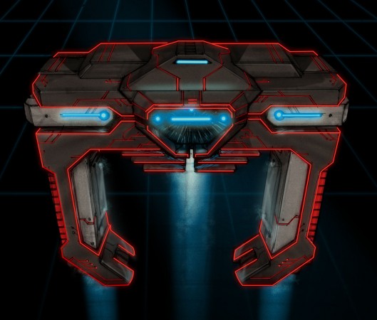
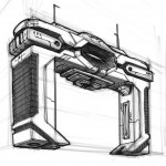
Anyway, I stayed close to the original version’s body shape. The original felt kind of skinny, so on this one I tried to beef it up by adding heavy shoulders and a thicker mid-section. That helped give the look more of an intimidation factor. I also tried to add some function to the look by adding some mechanical looking sections. For example, the silver-ish pieces on either side of the shoulders are rotating cannons. You can see more of that on the rough sketches.
My favorite addition is the power source in the mid-section. Imagine, if you will, a screen that starts out pitch black and the blue glow emerges out of the darkness followed by the red lines. Could totally be one of those O $#^@* moments in a movie. I also liked the addition of the blue lights coming out of the bottom. It looks like a jet stream in the sketch but really I see it as more of a spotlight or a tractor beam.
If anything color and texture has been one of my weak points, so I tried to push it a little this week. I didn’t go crazy, baby steps. I added a galvanized metal texture over the body and set the layer style to a soft light. The beams of light are a combo of gradient and some new texture brushes I found. And the chest glow is just a layer style (glow) with the noise turned up.
Well, that’s the last of the Tron series. Not sure what’s next but I’ll figure something out.
A
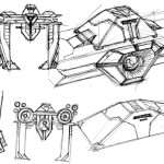
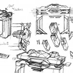
nice sketches as usual. the transition from rough sketch to finish is great. it took you long enough. what are you busy or something? the only thing i didn’t like about these, is that the subject matter has no persnality. it looks awesome, it just doesn’t have the fun that i was anticipating in your triumphant return. i don’t know how you’d show that with these, its just something i feel. besides, didn’t they already remake Tron? it was called the Matrix.
Yea the feeling you get from the original is a big mindless, lumbering, mindless beast. I had the idea of going full out and adding wings and all that crap but just didnt seem right.
Had a couple of freelance jobs lately. Which are always welcome, but not as fun as my concept art. That and babies are a lot of work.
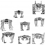
what were you thinking with the tentacle like sketches? they kind of look like those things from the Matrix.
I was trying to add more movement to concept. Toying around with the it never really acting like solid, lots of moving parts. If i was going to compare it to something i would compare it to the machines from war of the worlds.
my question is how are the recognizer legs going to turn as they do in the film seeing as they are all made from the same bit of metal
@Chris M. Thats a feature of the old one that didn’t carry over. No need to crush things when the new version has a cannon on the underside of it. It also doubles as a transport beam to lift passengers inside. Just make sure you flip the switch so you dont fry your passengers!